A well-defined creative personality

Arrabal 2.jpg

“Each of his drawings is a true independent creation. He never repeats or uses variations of other illustrations.” Fermin Fevre). 

At the headquarters of the Society of Newspaper and Magazine Distributors, Avenida Belgrano 1732, from 10th to 30th May 1983, a series of talks were given by Jorge Luis Borges, René Favaloro and other distinguished cultural personalities. These talks were in reference to the display of journalistic drawings by “Horacio Cardo, an artist whose creative values are at sight.” “Cardo has had the good idea of exhibiting the originals of some of the illustrations appeared in Clarín shown next to the page of the newspaper where they appeared. These works range from 1979 to-date and show the versatility of the artist to address many different issues. Throughout these he maintains a very definite creative personality beyond the diversity of the themes and the situations depicted.”
   “The language of Jacobson, the mediocrity of the TV, pictures of characters as diverse as Freud, Sartre, Pablo Neruda, Shakespeare, García Márquez, Polanski or Bergman or the difficult task of illustrating such pressing questions as: Who is behind trying to discredit culture?, or the various nuances of popular music, all these form part of the universe of images that Horacio Cardo offers daily.”
   “All this is enough to give us a dimension of his dual status as a journalist that captures the essence of each message, and an artist who creates from reality, and he highlights this and combines it with fantasy.”
  “Horacio Cardo's work revives the creative direction of graphic illustration and the power of communication with the means of mechanical reproduction. Each of his drawings is a true independent creation in itself. He never repeats himself or paints variations or earlier works, turning his vital feelings into creating.”

Fermin Fevre, art critic.
May 21, 1983.


Fermin Fevre. Art critic. Born in 1939, he was vice president of the Argentina Association of Art Critics, Director of the National Endowment for the Arts, the National Library Consultant and Director of the National Museum of Fine Arts, the Department of Arts and Culture at the University “Tres de Febrero” and holder of the art magazine “Arte al Día”. He published five books: “Kundera, the harsh reality”; “Postmodernism in Art”, “The work of modern art”, “Modernity and postmodernism in Art” and “Thirty years of Argentine Art (1966-1996)”. On June 3, 2005 died in a car accident in front of the Jockey Club of San Isidro.


Tempts the viewer to a tactile communication, almost voluptuous, where sensitivity and aggression seem to blend into a sum of sensations.

From left to right: my daughter Ivana Muriel Cardo; my first former wife Silvia Arenales; me; at my side, my son, Iara Gabriel Cardo; below him, my daughter Sabrina Sofía Cardo; at her side, my daughter Samanta Brenda Cardo; in the front, my mother,…

From left to right: my daughter Ivana Muriel Cardo; my first former wife Silvia Arenales; me; at my side, my son, Iara Gabriel Cardo; below him, my daughter Sabrina Sofía Cardo; at her side, my daughter Samanta Brenda Cardo; in the front, my mother, Blanca Esther Badde; to her right, my daughter Nuria Andrea Cardo; behind my mother, my sister, Edith Mabel Cardo Dodds; at her side, partially seen, her daughter, Janine Dodds; and at right, my aunt and godmother, Norma Badde. 

The works exhibited by Horacio Cardo at the Art and Communication Center, Viamonte 452, highlights the plastic qualities of this artist, who is best known for his graphic work.

   Five large paintings, collages and almost fifty drawings done in mixed media give us an approach to Horacio Cardo’s fantasy world. The treatment of different visual languages, as line, color and collage, convey a world bordering surrealism, where sensuality plays an important role. A rich gallery of incidental characters and situations are the plastic means by

which brings his proposal. It is interesting to note that these works done to accompany various mass media texts have a significance that goes beyond the circumstantial anecdote, and lead us to review the concept of illustration, a term usually used with connotations of negative value. Cases like the present one evidence the prejudist of such convention. The unit of creation’s activity found in these relationships can be established between

“Sketch for a neighborhood’s love”, a drawing, and “Neighborhood’s love”, a painting-collage. Both surrealism components are present and manifested by the spatial ambiguity and juxtaposition of planes and figures. In the picture is the development of the line that structures the composition in the collage, the solutions reached between the relationship of volume and flatness, as well as the variety of materials used to bind the implementation of expressive color as a whole. In “The sorista of Adhesa”, a collage-painting, is achieved a grand synthesis in volume image and sensuality.

Creative Unityby Albert H. Collazo. Clarin. Visual Arts, Saturday, August 20, 1988.


Creative Unit

A rey depuesto....jpg

Introduction by Architect Tomás Dagnino for the Catalogue of the mentioned exhibit,
inaugurated August, 12, 1988.

Horacio Cardo’s renown career as an artist, shown throughout his multiple publications –both national and international- for which he has done illustrations, and based mainly in the graphic quality of his trace combined with the ductile way in which he works with textures, has given way to a skillful colorist that very soon surprises us with a succession of paintings that due to their sectional three-dimensionality become “objects” where the strength of the drawings is moved to polychromy.  

   In them, the deep and creative interior self is present, and the poetical spirit nourishes to draw his monochromatic metaphors, and although in some cases, the recreation of a theme seems to tie him to interpretations, it is sufficient to concentrate in the pictorial qualities to recognize the communicative power of the author, as he goes re-dimensioning the fantasy message that can engulf every work of art. 

   If in his drawings it was easy to feel that special climate in search of rescuing the subliminal expressions of a written message, a neo-figurative explosion arises in his paintings, a formal de-codification where the line is now the correlate of tones, while textures take shape, tempting the viewer to an almost voluptuous tactile communication, where sensitivity and aggression seem to muddle into a combination of sensations. While speaking about sensitivity, we cannot forget everything he has showed through his mentioned drawings. It is that sensitivity, which has given impulse to color, and it is his constant spirit, which dives constantly into shapes, which has led him —and will continue to push him— to materialize, each time with greater rigorous plasticity, the union of the lines, textures and colors, that build his real language. 


Exhibition: Artists of The Nation

The Art of Social Commentary

Catalogue The Nation.jpg

The Nation, America’s oldest continuosly published weekly, was founded in 1865 as an independent forum for the discussion of “the topics of the day.” The Nation will not be the organ of any party, sect or body. It will, on the contrary, make an earnest effort to bring to the discussion of political and social questions a really critical spirit, and to wage war upon dthe vices of violence, exaggeration and misrepresentation by which so much of the political writing of the day is marred.” Founded in a spirit of dissent, for 125 years the magazine was fulfilled its mission by offering a perspective that might be considered subversive on “the topics of the day.”

   Addressing the possibilities of literature in 1930, Lionel Trilling, a contributor to The Nation, affirmed this role as essential to art itself: “The salvation of American art lies…in it becoming subversive and dangerous to the social order.” Such is the spirit that, in different ways, informs the graphic art that has accompanied the critical writing of the progressive weekly. The drawings shown in this anniversary exhibition participate in a tradition of social commentary that has found its models in the art of Hogarth and Goya, Daumier and, in America, Thomas Nast.

   Artists of The Nation have commented on “the topics of the day” using various graphic styles and expressive modes, from outright assault to subtle indirection; they have exploited satirical cartoon and caricature, personification and allegory. Chronologically, the exhibition ranges from the decorative modernism of Louis Lozowick in the 1920s to the sharp pen-and-inkmanship of David Levine, which finds its inspiration in the great illustrators of the late nineteenth century, like John Tenniel. It includes the proletarian illustration of William Gropper and the sometimes too politely winsome caricature of David Low, as well as the more sophisticated and self-conscious artistic ambition of Ben Shahn. Among the recent transformations of this tradition are Horacio Fidel Cardo’s symbolically charged and challenging designs and the modern industrial beasts of Marshall Arisman. Perhaps the two most representative artists, those who have recently given their own particular stamp to The Nation, are Edward Sorel, whos comic strips are exploded by the sheer graphic energy of his pen, and Ed Koren, whose “furry boobies” appropriately figure aspects of American society today.

David Rosand

Chair of the Art History and Archeology Department at Columbia University.

Brushes with politics

Diosa Kali de la abundancia tecnológica.jpg

Someone once criticized The Nation for being “reader-unfriendly.” When I asked him to say a little more, he added, “Well, you don’t have a cover, you have too many words, and not enough pictures.”

   Of course, we do have a cover. Although occasionally we go to all-art covers for special issues, week in and week out we begin our articles on the cover, which also includes an editorial and a billboard spine in a format designed by Milton Glaser and Walter Bernard.

   The fact that the cover is made up of words is, in itself, a visual statement of what the reader might expect to find inside: news, analysis, essays, the stuff of a dissenting journal of critical opinion. And muckraking, poetry, satire, reviews, the stuff of a journal devoted to covering the culture as well as the political culture.

   But it’s the art of our politics that is the surprise. The art of our artists. What is intriguing about the works of art in this exhibit, all taken from the pages of The Nation, is (a) that they were created for the most part on a weekly deadline, (b) that they are works of art, and (c) that for the most part they were created to coexist with particular articles, yet because each of these drawings makes its own statement, they have endured in many instances long after the words that inspired them have been forgotten.

   The ability of art —even black-and-white art in an age of color TV— to incite its audience to action may be inferred from my own experience as editor of The Nation, a notorious bastion of word people. Only twice in my thirteen-year tenure as editor has the staff petitioned (both times in advance of publication and despite an almost reflexive revulsion at the notion of prior restraint) to keep something out of the magazine. And each time it involved a piece of art. As it happens, both of those inciting art objects are in this show. It matters not which ones they are but that even in this age of sensory overload, these sketches, caricatures and cutting cartoons retain the power of art to question-raise, flatter, insult and threaten the viewer. What higher cumpliment could be paid to the motley brigade of artists who have, over the years, invaded The Nation’s pages with their beautiful disturbances?

By Victor Navasky
Editor of The Nation


Exhibited at the Schermerhorn Hall de la Miriam and Ira D.Wallach Art Gallery, Schermerhorn Hall, Columbia University, New York City, from November 15ththru January 26th, 1991. 

A symposium moderated by Arthur C.Danto, with Marshall Arisman, Horacio Cardo, Jules Feiffer, David Levine and Edward Sorel, was held on December 4 at 6.30 pm in 501 Schermerhorn Hall. The symposium was sponsored by Columbia University Center for American Culture and the  Miriam and Ira D. Wallach Fine Arts Center.

Harvard University, de Cambridge, Massachusetts, exhibited the show at the Josep Lluis Sert Gallery, Carpenter Center for the Visual Arts, from May 1st thru June 6th, 1991.

Finally, the Art Center College of Design brought the exhibition to  Pasadena, California, which open on June 17ththru August 2nd, 1992.


Selected artists: Marshall Arisman, Tony Auth, Walter Bernard, Horacio Cardo, Larry Carroll, Seymour Chwast, Fritz Eichenberg, Randall Enos, Hugo Gellert, William Gropper, Robert Grossman, Monica Incisa, Francis Jetter, Ed Koren, David Levine, David Low, Louis Lozowick, Isadore Seltzer, Ben Shahn, David Shannon, Edward Sorel, Vicky, Art Young.

The power of the visual image

La profecía.jpg

Horacio Cardo displays the multiple facets of his work in La Plata, after two decades of absence

If you pay attention when you read newspapers and magazines, it is not difficult at first sight to identify the work of Horacio Cardo, because for years we have been seeing his illustrations in the most important media of our country and the world (as in New York Times, where he has worked for many years).

  Illustrator and artist with an extensive career, the artist has always been drawing, especially for the printed media.  Due to his original illustrations technique and his perception, acid synthesis and irony, Cardo has earned his place among the most prolific and important illustrators of Argentina.

  The characteristic that identifies his work is the combination of visual textures and different visual perspectives he achieves when he draws and combines digital and formal analog resolutions. To describe it in a different way, Cardo starts his compositions with a free hand drawing with pencil, ink, and paint.  He continues tearing and pasting paper to make a collage on the base paper.  He then scans the image and adds finishing touches with digital programs.  

  In this way, the process becomes a real unprejudiced combination, an effort to capitalize casual combinations of forms that not only occur on the sheet of paper of his illustrations but also in his compositions and other works. In fact, Cardo performs on paper as he does in life: fearless of taking risks. Because the artist leads an unusual kind of life, his own friends define him as an authentic “globetrotter”.  He traveled for many years in the Caribbean, Europe, South America, the U.S. and the Pacific Islands, where for example,the Suadinaiinitiated the artist and his friend the poet Robert Rivas, in the difficult art of “walking on the roofs of dreams”, as he mentions.

  In the same way that he is a multi-nomad, the artist is also a multi-prize winner:  he has won some twenty international prizes and has been proposed to be nominated for the Pulitzer Prize by Jack Rosenthal, chief editor of New York Times.

   But getting back to basics, what do you see when looking at Cardo’s illustrations?  What is recurrent in his work?  Even though when looking at something, it all depends on the perception of the viewer, almost no one can deny that in his illustrations visual textures predominate, simulating flesh, fat, the lines in striped shirts and blouses, denim, skin, feathers, teeth, maps and blood.

  The drawings and caricatures of Bush, Gorbachev, Kennedy, Obama, Berlusconi and Clinton are created from these elaborated textures.  In Cardo’s work there is nothing naive, in fact, quite the opposite.  In these illustrations, the expression of his drawings, and the solid elaborations he creates through his unique use of collage, Cardo looks and makes up worlds with shrewd insight and synthesis, forming a junction area, both at a conceptual and formal level.

  At present, after much travel, the artist decided to seek refuge for himself and his works by the sea.  From the corners of his home and studio in Pinamar, where he has lived for the past seven years, Cardo discloses all kinds of paintings.

  But for those of us who are not there, in the midst of that clearer and damp nature, the possibility of learning about his work is at present at the Pettoruti Hall of the Teatro Argentino in La Plata’s Art Center, where the artist exhibits a sort of retrospective exhibition “Testimonials”. 

Mercedes Perez Bergliaffa 


Paintings against equalized art

Horacio Cardo is a reference in visual art and graphic journalism, and for the first time in 22 years,
the “Testimonials” exhibition offers a tour of his work.

Egonías 1.jpg
Egonías 2.jpg
Egonías 3.jpg

Justice at last: for 22 years Horacio Cardo, a creator of brush, pencil and digital weapons, has not exhibited his work in Argentina. In 1987 he moved to New York, so his work could not be seen in Argentina except for the drawings published by Clarín newspaper. As from June 14 in La Plata, those who visit the “Testimonials” exhibition, at the Pettoruti Hall of the Teatro Argentino shall have their revenge: 40 years of visual challenges in collage and size alive, as if one could still hear the work going on with the materials or with the digital programs. 

  But aside from this exhibition, his work already belongs to countless readers as they have been published in many newspapers in the United States, and in Clarín in Argentina since 1979.  In La Plata you can find many of his illustrations published by the press as well as his paintings: “in other words, my life in relation to the community and my private life” says Cardo, who has settled in Pinamar now, maybe to contrast shapes and colors with the sea.

  Cardo still tries to “harmonize what one feels with what one produces” and he confides: “We are books to which pages are added day after day. This advance towards the retreating inner horizon is what keeps our interest alive”. And when thinking about the press, specifically graphical, he subscribes to an idea of Harrison Salisbury, editor of the New York Times: “the task is not to “illustrate” a journalist text, but to provide the reader with an image insinuating an environment or atmosphere that extends and expands the impact of words”. That is why he does not feel at ease with the term “illustrate”, that refers to a sidecar for a text.  Image and text share the page and complement each other through affirmation or dissent.

  And he anticipates a possible surprise for visitors to the exhibition: “an encounter with my paintings and the illustrations of my satirical book on Freud that have never been exhibited before”. How could the witnesses of “Testimonial”, fascinated by his ironic and burning strokes, mitigate the anxiety of wondering about the rest of his work that has not been included?  In addition to thousands of drawings, works remain at his home —that are like pieces of furniture— affixed in complex ways to the walls, which would be a challenge to transport.  Such as the triptych suspended high above in his living room, that measures 3.80 x 2.20 meters.

  And he sets his eyes upon the peculiar forms of the ceiling: he is rarely satisfied with his work, because upon finishing it “one understands one could have done it better; otherwise we would be using a method proven as infallible for certain results; it would be like copying our own work. And in such works the breath of death would be perceived.” He says: “I feel the indignation that makes me destroy or burn a painting”.

  During the 60s, in full experimentation stage, “I recreated my world every day, with each issue of the Pinacoteca de los Genios (a weekly publication of those days).  The first revelation was Goya, then Modigliani, etc., several extraordinary artists of outstanding personality”. Through other books he came to learn about the Abstract Expressionists and Pop Art. Until one day, at the Di Tella Institute, “I was struck by the Imaginary Portrait of Brigitte Bardot, by Antonio Saura”. We are anthropophagus and have within us fragments of those who preceded us. Our own personality is what makes us unique, as it allows the fine tuning which leads to a certain form.”  

   Today, always much further from the anxiety of a perfect image, and without tensions, Horacio Cardo awaits and says: “I have nothing pending because I do not know what my thoughts will be in the future. Though technical advances not always anticipate a future for art and the person who produces them, the discoveries of my youth are today reduced to pure technology.  The intellectual effervescence that gave birth to so many schools and different ways of focusing on art is not seen today. Everything looks sadly equalized.”

Patricio Féminis  

The basis of illustration

Hero

Hero

Horacio Cardo (www.horaciocardo.com) was born in 1944.  He won his first Gold Medal at the age of 20.  He lived in Manhattan, New York for twelve years, where he received more than 20 distinctions and he was nominated to the Pulitzer prize.  He has worked with the New York Times for twenty five years, and illustrated in many international publications, such as Washington Post, Los Angeles Times and Playboy, amongst others.

 —How did you discover your vocations for art?

 —At the age of seven, I asked to study painting and piano, besides going to a bilingual school.  Some years later, I began to make newspapers for my schoolmates. I used to create the headlines out of bottle cork cuttings (which I also used as stamps), I used to type the text with my father´s typewriter, and I drew the images.  The amount of newspapers was reduced, only one for all my classmates.  There were not newspapers returned.  I would like to believe that in a certain way, it anticipated today’s tendency with newspapers: it was free.

 —How did you get started in the editorial illustration’s world?

Rancor

Rancor

 —I was hired as a book illustrator for Compañía General Fabril Editora.   I was 21 years old.  At such a young age I discovered the sordid world of the printers with whom we shared the auditing of works.  One would trust our work to them, and they would make different and involuntary copies, as many as printed.

 —Which were your artistic influences?

 —During different times I received the influence of various artists, although I don’t think there are any trails of such invasions in my work:  Modigliani, Gauguin, Dubuffet, Antonio Saura, André Francois, Candido Portinari, Ronald Searle, the wildness and freedom of Abstract Expressionists (including less promoted Europeans), the Chinese graphics, Kokoschka, African art and specially Egyptian and pre-Columbian art.  As you may see, a wide yet incomplete cocktail, because I could list many more. 

 —Your work has been published in several continents.  Do you work differently, thinking for example in the French reader, or the North American or the Spanish? 

 —No, the same way.  Long time before the term Globalization was used, the western countries already shared the collective imagination.  To use an allegory based in Tom Thumb, for example is comprehensive to all.

—In what way did technology influence your work?

 —It was an extraordinary input that brought vitality to my burden.  If this had not occurred I may have stopped drawing professionally.   

  —In your recent work, you mix painting with digital images.  Can you tell us a few details of your technique?

  —I try to use the best of both worlds.  I make a drawing in the traditional way and as freely as possible, because the computer is unable to produce the personal touch (traces of the paintbrush, maybe the main characteristic of my work), then I scan and continue to work with the computer, which has an impressive capacity to produce all sorts of alterations, changes, collage positioning amongst others, impossible to achieve manually.

 —Why have you chosen Macintosh as your informatics platform?

 -Because the experts I consulted initially recommended it as being simple, stable and problem-free.  Time proved it right. 

 —Can you describe the creative process when you have to conceptualize a  text into images?

 —I try to understand what I think is the essence of the subject.  Then, if possible, I try to associate it with an image collectively used.  Finally, I do the best to give it an extra touch.  In ¨Rencor¨ (“Rancor”, bottom left) the essence of the subject was the secret violence within us. The collective image that best identifies that violence within our body is, in my opinion that of a fist in a boxing glove.   The extra twist, would be the industriousness, the silent tissue round with which we each mask that horror.

 —Which are, in your opinion, the main characteristics inherent to the editorial illustration? 

 —I think that the basis of illustration is to establish relationships, to find a bridge between the situation and anything that might unveil it dramatically.  If it is correct, it will shaken the reader and will dispose him to stop and think. It is almost determinant it must be artistic, visceral, in accordance with the depth of the information it goes with. Harrison Salisbury,  Pulitzer Prize winner and Editor to New York Times editorial knew this when he admitted: “Artists lead editors, showing them how the images can stimulate and establish a receptive mood in readers so that the ideas in the text can penetrate in them more deeply”.  It is honorable and exceptional to find editors with this level of thinking, and we most often find them ahead of the most prestigious newspapers.   Usually the editor tolerates an image that in his perspective lessens his leadership and limits him to develop his text  (overwhelmingly) even further.

Pablo Blasberg

Creation as vertigo 

Capitalism

Capitalism

For over four decades he is part of graphic art in Argentina and the United States, amongst other countries.  He creates images that far from illustrating or complementing a text, editorialize, are ironical, express opinions and are questioning.  Until very recently he exhibited a part of his extensive and technically diverse work at the Teatro Argentino.  In this interview, he talks about his work, his trajectory and motives of inspiration.
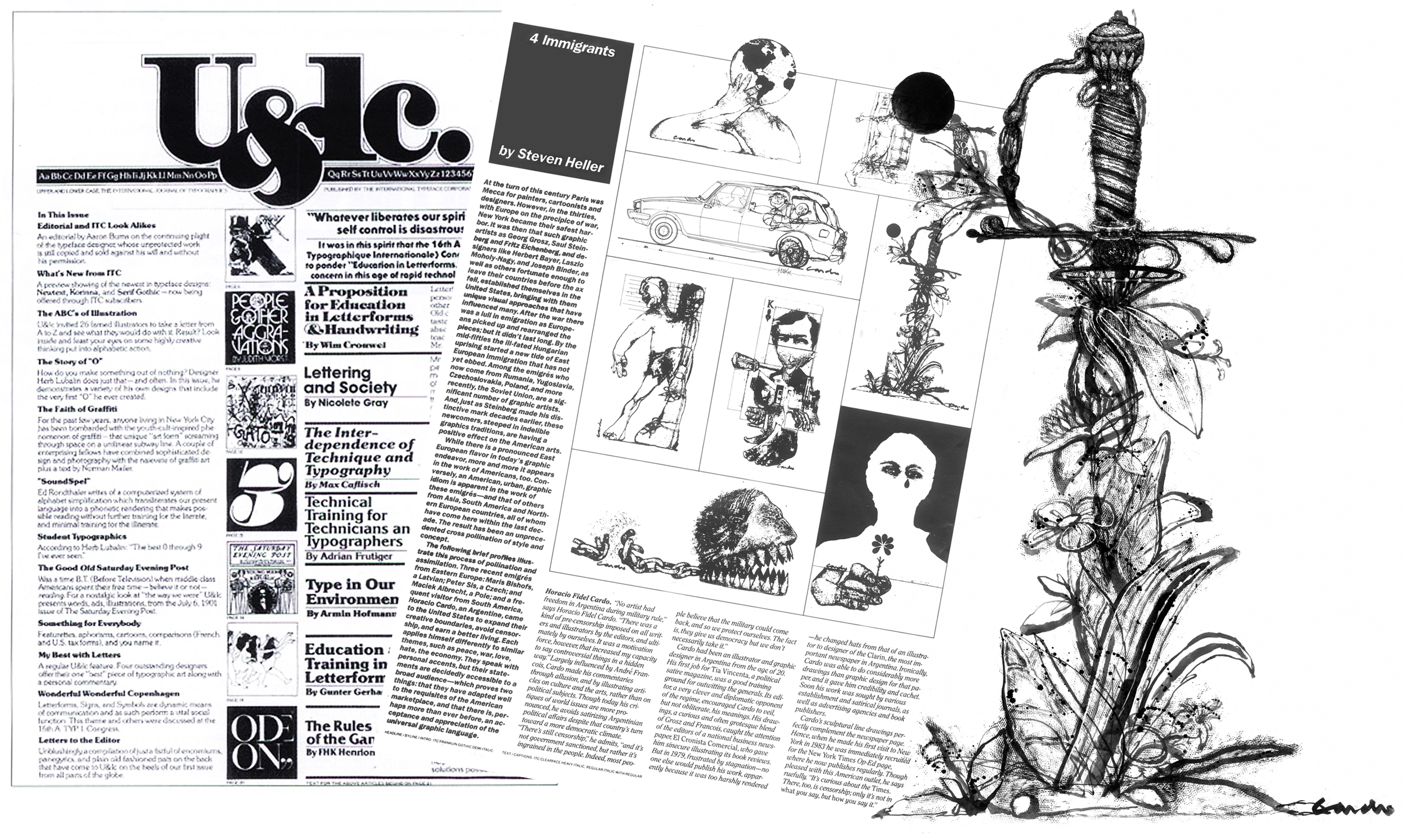
   Horacio Cardo was born in 1944 in Temperley, province of Buenos Aires.  He currently lives in Pinamar, where he works in his two passions:  illustration and painting.  Illustrator of Clarín newspaper for twenty six years and in fact, from there, his work has become well known by the public. He lived in Manhattan, New York, where he regularly worked for the New York Times, since 1983 to 2007.  His drawings were simultaneously seen in almost every newspaper and magazine in the United States, as much as Europe and Asia.  He illustrated posters for movies and Broadway plays, and books for several editorials, amongst which are covers for Planeta Editorial, Madrid. 
   He received more than twenty national and international awards and was even nominated for the Pulitzer Prize by Jack Rosenthal, Chief Editor of the New York Times

   At the age of twenty one he started working for Fabril Editora Company.  What impression do you have from that experience?  In what ways did those years contribute to your later development?  

   It was my first adaptation to graphic demands. Until that moment I had painted and illustrated and drawn freely and I had never worried about how not to cause unnecessary problems to printers and engravers (consider that I am talking about 1965), nor for how to make the best out of the limited possibilities with which you counted then. That can be easily seen if you observe the drawings I made for Jorge Luis Borges and Silvina Bullrich’s  book “El Compadrito”, that were gently described as “very personal” by a critic from La Nación newspaper. Under the view of what our job is nowadays, I can’t understand how Chief Editorial Jorge Iaquinandi did not object to them. There was high respect for the illustrator’s work, who were considered co-authors of the intellectual material. 

   While working for the media, what benefits and creative problems does the delivery time limit cause?

   Adapting to the newspapers, where most times, delivery must be done immediately, frantically activates the associations generated while reading the material. The mind works in flashes. It takes on a rhythm that cannot be maintained for long and ends up wearing you down. Then the batteries re-charge again, getting ready for another acceleration. That is the way I feel it. The negative aspect of adapting to a job with such little time for delivery is that you must send everything you have done, whether you like it or not and 

the more you look at the drawing, the more changes and improvements (or even an entire and completely different approach to the subject) prove that would have been necessary. Those torments disappear with time and you limit yourself to waiting for next day’s edition buries the sad memory that the previous one may have left. 

  The rush sometimes becomes a vice and when you have lots of time to conceive the way of executing a painting, ends feeling confused, multiplying unnecessary paths that end up tiring and wearing us down. 

   While sketching for a drawing that will accompany an article or interview, what is your working method? Do you read it before you start working on an image or do you draw based on a summary or an idea about the subject proposed by the editor?

   Most times I read the article or interview. There are some others when it has not arrived yet, but the author has sent a summary in which he informs what he will be writing about. In both cases, the extract is done by the illustrator. A central idea is illustrated, either written or insinuated by a group of factors. Years ago, I used to work for different sections of the New York Times. Amongst them, the Weekend Review, that closed on Saturdays.    The Art Director had the habit of literally keeping to the text,  in spite of not being notoriously impossible (let me add that in the United States it is habitual to present a previous sketch of the final original, which European tradition —used in Argentina— is and was considered almost offensive).   When you presented an idea, the Art Director would fire back with the reading of another particular paragraph, then, if you illustrated in accordance to that paragraph, he would bring forward another one, and so on, considering the mood in which he had got up that day. Because if you read a text, you will see that different concepts are connected in reference to a final intention. Until one day, everything went wrong and I finally told him in the worst way that I never wanted to work with him again. The paradox is that, apart from designing for the Times, he also worked as a free-lance illustrator. 

   Could it ever happen that you had to make an image to an interview or article that expresses ideas or thoughts with which you disagree?  In any case, how do you manage your own opinion about the subject written? 

   That happens, indeed. In the United States, the Art Directors usually ask if you agree or not and if you wish to illustrate the article that you are being sent. That is very respectful. If you work for someone and you illustrate a particular section regularly, you resort to irony to get rid of the complicity that would mean to reaffirm that is written.

  To find a way out to this kind of situations, the editors of the Op-Ed (opposite page of the Editorial) of the New York Times, conceived in 1988 the idea of publishing images that were independent to the text, together with a headline. They were called “Free Statements”, something similar to independent opinions, but the idea did not take on. Years later, during a visit to Paris with Jerelle Kraus —former wife that belonged to the staff of Art Directors of that newspaper— we commented to the Art Director of  Le Monde, Dominique Roynette, who was dedicated to re-designing the newspaper and she put it into practice.  

   Are there moments in which you have to limit the allegoric intention or those in which the relationship is near realization? When this happens, how do you work it out? 

   The mass media holds in a great scope of people. In order to understand the contents, it is usually recommended to work for the proverbial common cause, which no one can determine. Every time I illustrate something, I ask two or three people what it is that they see in the drawing. I try in a smaller scale, to be as clear as possible, but I think that it is unreal to think that the majority will understand.

   Which is your style ?  How did you get to it?

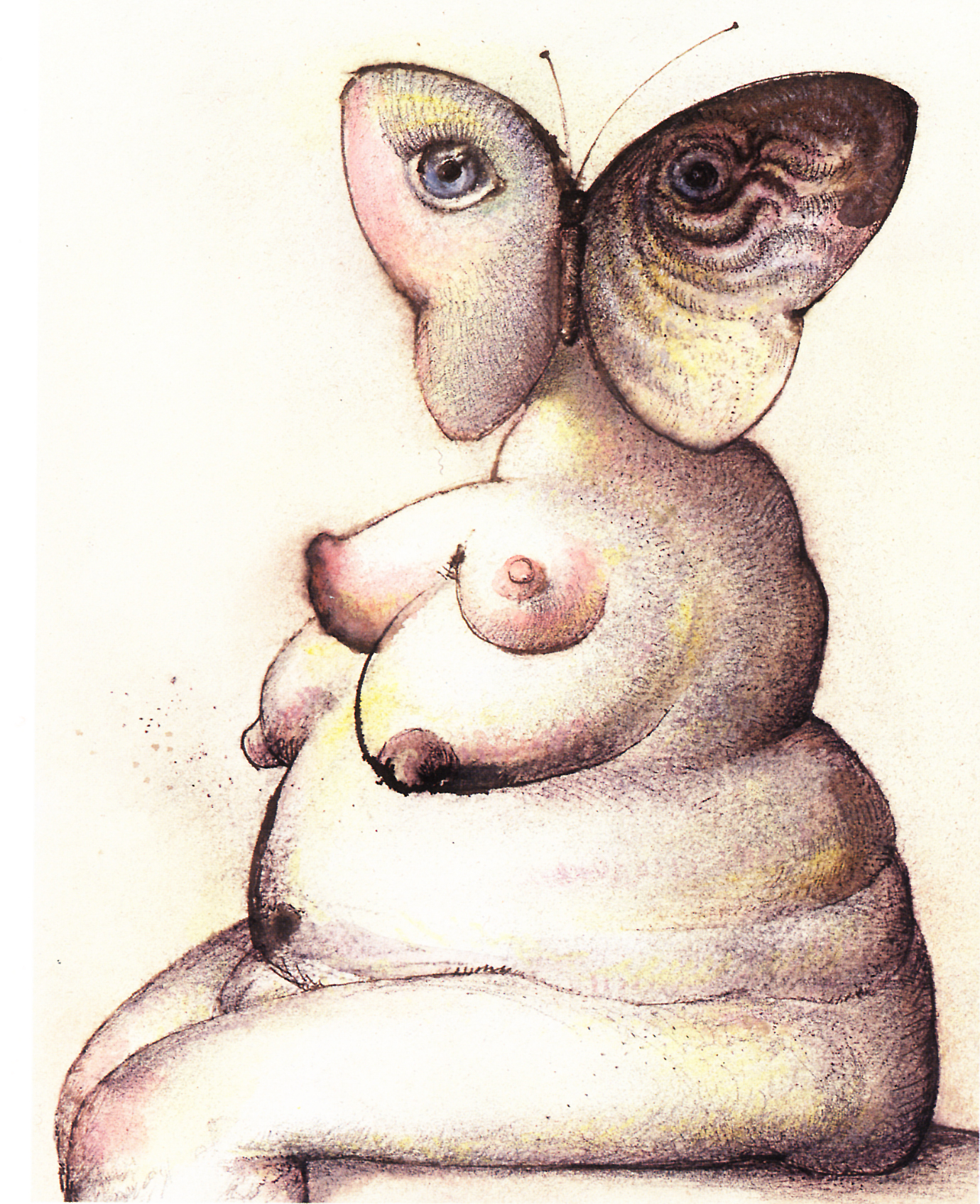
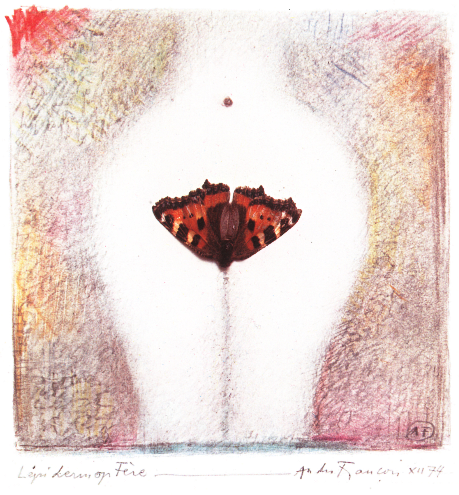
   I think it is the outline of my paintbrush and the technique I created to work originally only in black and white in the newspapers decades ago.  Despite the dramatic technological advances, I try to preserve that personal touch to plan diverse and various ideas. It is possible that other artists do not coincide with this, to do it otherwise would be equivalent to speak with a different voice just for the fun of change. I think we owe Picasso the haste for change that is given nowadays, in spite of the fact that the Great Masters, who have at some point reached a certain personal maturity, fitted to the means to communicate.  

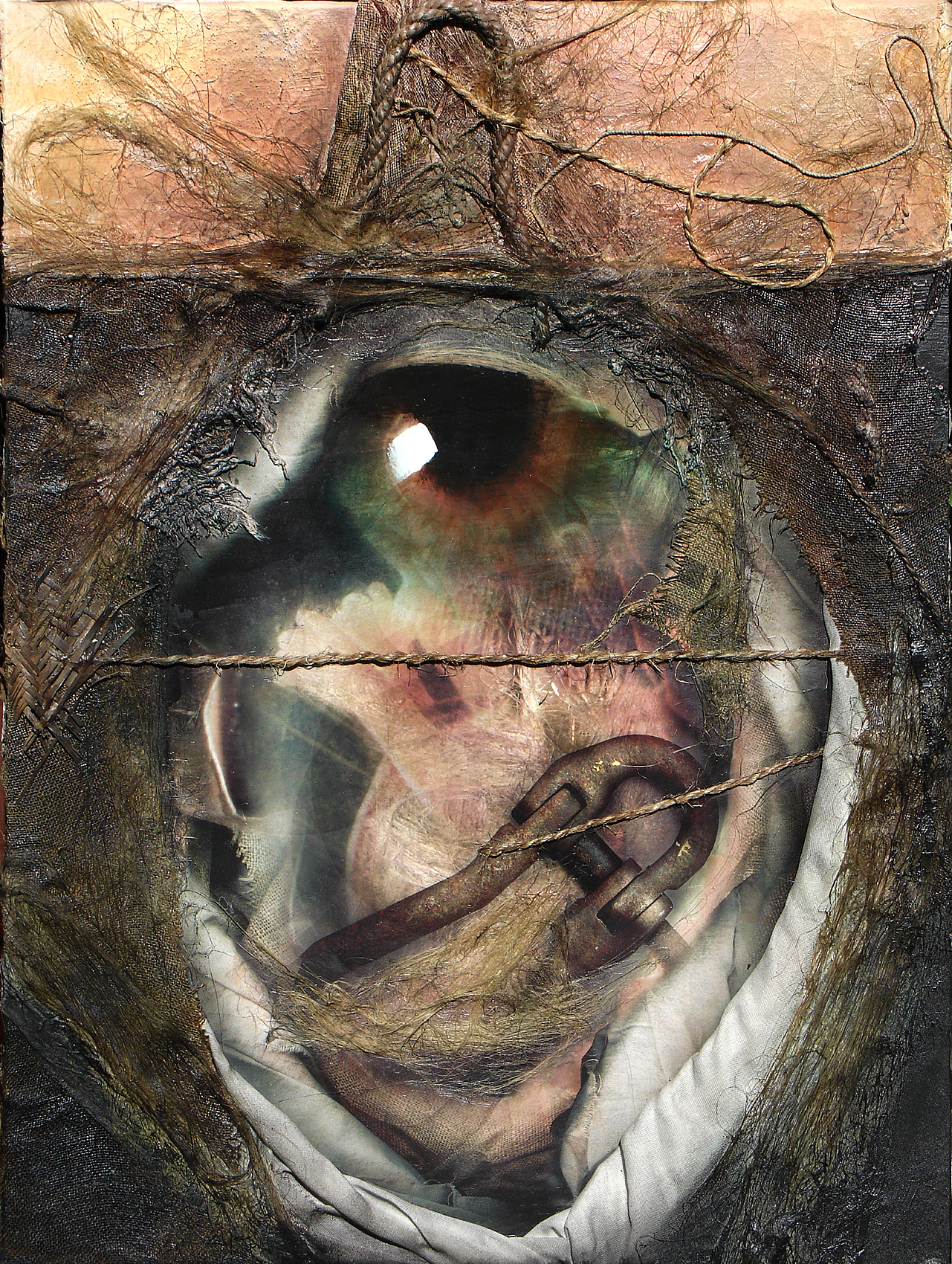
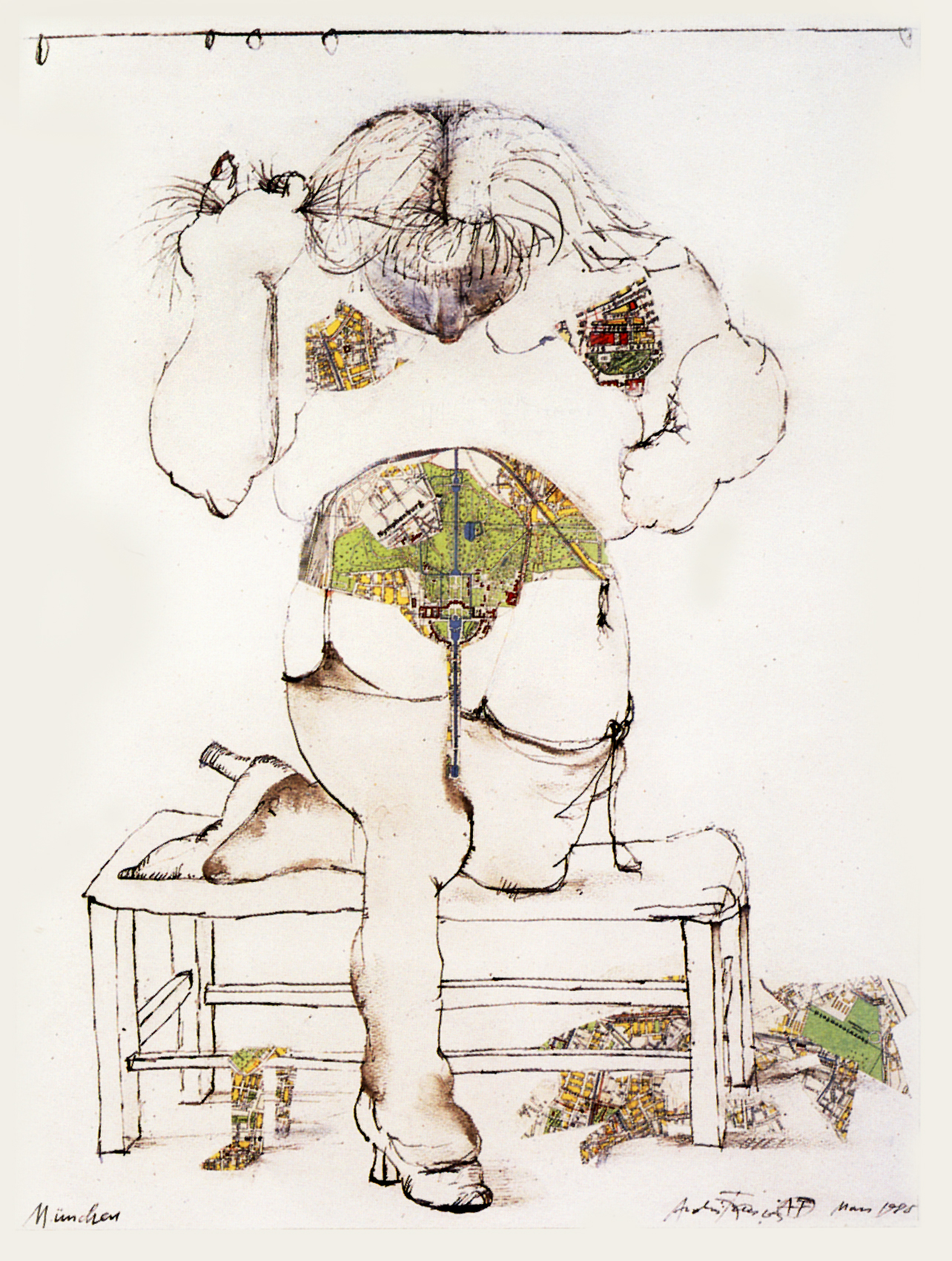
   One of your resources is collage. There are great collage teachers in the avant-garde art and the denunciation art performed as from the beginning of the twentieth century up to nowadays.  Is this also for you a technique that is associated with certain rebelliousness? 

   I don’t consider the use of collage as a form of rebelliousness, least of all nowadays, when its use is so widespread. I don’t consider that artists that used it in the past have innovated in that respect, since African art, for example, uses it freely and unreservedly. Collage is a strange object, like from another dimension, that is eaten by the drawing’s antibodies, but end up changed by that action. The enrichment achieved by its use is impossible to fulfill otherwise, and digitalization has notoriously opened its possibilities.  

   Three of the illustrators whom I had the chance to interview (Hermenegildo Sábat, Oscar Grillo and yourself) name expressionism as the artistic movement that identifies you. What does expressionism have that it enables to preserve its force and validity and why do we feel it so close to our sensitivity? 

   My opinion is that expressionism is something more than a movement, because it exceeds the pictorial treatment, the search of an original way of working. I think that expressionism resides within every artist, whether he admits it or not. It’s like a dramatic eruption possessed in spite of oneself.   That is why, even when it was officially conceived a long time ago, its sprouts will remain intact for as long as art exists.

   Amongst your artistic elections are Egyptian and Pre-Columbian art.  How do you think the artist and his creation are placed nowadays in relation with these times in which art was not personal but communicative and it was performed with pre-established composition and motifs, and not as the expression of an individual inspiration?

   What I treasure from them is exactly their communal character, not the proceedings surrounding the realization. Because I don’t conceive what sense may be in art that does not interact with the community. Our means of communication and Internet are the equivalent of public monuments of the past, and they provide us with optimum conditions to perform community art. What is notorious is that, given these possibilities, the establishment has undervalued it.

   What motif, figure or color is your constant?

   This is the question, that if I could answer would end with the constancy in my work. I wish I could have the capacity to move with absolute freedom.

  Where do you go for a source of inspiration when you don’t  have a subject given from the outside? 

   To myself, but shortly after going down that path, I find it extremely limited, boring and repetitive.  I once dreamed I was in a huge plain, surrounded by silent humanoids. A large moon, buttoned to the sky, gave light to all the valley, while an imposing voice read a series of very boring and monochord stories. I asked myself, who could ever be interested in such vulgarities.  I was then aware that the voice retold my life: I had died and was listening to all the enumerations freed of my ego.  This is what I mean. 

   Which are the advantages of working with the new technologies? Has anything been lost with regards to when everything was handmade? 

   The new technologies have provided man with extraordinary tools. Whoever has worked in graphic arts during —lets say— forty years, knows perfectly well what I am talking about. Nowadays, a great deal of work is handicraft. There will always be those who complain or reject advances.  Years ago, an artist who visited me, happened to admire a 3 dimension work of mine until she came closer to it and almost shouted: “This is not fair!”  When I asked her what she meant, she told me I had cheated: using airbrush.  Some ancient artists painted the depth of the sky using up to forty layers of very pale blue oil mixed with layers of insulation. Should an artist nowadays have to use the same procedure? The hyperrealistic painters use the airbrush not to treat an area, but the entire surface of the painting, and it is considered art. The use of the slide projector is also questioned. What is the difference between the use —clearly in disadvantage— of grids used by the ancient artists? And didn’t the Dutch artists  use a closed, dark box, with a frontal hole that enabled the pass of light (the scene), which was projected over some posterior sort of paper?  (in other words, they traced reality).  Nobody refuses or questions them, however.  I think we are in the presence of a verbal excess in an almost unnecessary field.

   To what subject, character or situation would you dedicate an illustrated book? 

   I have written and illustrated a presumably sarcastic and imaginary book, based partly in Freud’s life and his absurd delirium of selves, super selves, Electras, Edipos, the wolf man and other colorful characters from masterpieces which he ruined when he immersed them into the pseudo-scientific world, but I dedicated it not in admiration, but by profound disgust, for the enormous social damage that his huge ego had caused. In a few years, nobody will understand how this nonsense lacking all form of scientific basis (now it has been demonstrated that almost all the cases he presented as example had been made up) made such an impact, that it even had a word in the outcome of life and death in many people, as it was considered an important tool to be used in various disciplines, especially by judges.

Javiera Gutiérrez 


Cardo’s magic

Ku Kux Klan in the Army (for New York Times' Op-Ed Page)

Ku Kux Klan in the Army (for New York Times' Op-Ed Page)

Interview by Omar Zevallos for Artefacto magazine

Horacio Cardo is an extraordinary artist, illustrator and above all, an analyst of the human mind, who has shown his art in the United States, Europe, and Latin America.  He has worked for the New York Times, Washington Post and many others.  Cardo is one of the greatest artists.

   How much has your work evolved ever since you started in editorial illustration? 

   I don't know if I have evolved, rather have become professional.  When I started, my drawings were extreme, a lot more personal, maybe more authentic. I haven't been able to (or haven't wanted) to know. 

   Has your work for magazines or newspapers been enriching, from the artistic point of view?

   In my case, working for the media has made me relate and therefore made that relationship clear to the unknown reader. I think the importance of illustration is having to come out of one self, from the big wheel (big or small) within, this does not happen to the painter or the humorist because they choose their themes freely.  I think that this may lead them to become repetitive.

   Has the working method changed in order to adapt to the urgencies of the media?

   Of course.  The rhythm of a newspaper requires that an illustration must be done immediately, something that is considerably stressful at the beginning and influences the result.  One cannot use sophisticated techniques, due to lack of time and rudimental reproduction, which ends exhibiting finished results that are not alike to the original files (due to the quality of paper and printing speed).  The effects must be made more evident so that they may not be lost in the process.     

   How does the creative process take place?

   Like I said before, it is based in relating, in associating.  The more connections, the better in terms of results.  This may be the only advantage of age: accumulation.  

   What materials or what software do you use for your work?

   Usually, traditional elements:  pencil, indian ink, tempera and acrylic, and depending on the time given, palette knife, paintbrush or other elements.  Then I scan and I continue working on the computer using photoshop.  I also use digitalized personal palettes, scanned photos or images of objects, all of this stored previously to be invoked through Bridge.

   Was it easy to adapt to technological advances?

   My interest in Photoshop started as from the incorporation of layers.  Working via e-mail has been fundamental for all, I think we all agree on that. In the United States I faxed the sketches and the originals were sent by courier. The system was remarkably efficient: an original dispatched at seven PM from New York,  arrives —due to the time difference— to Los Angeles before the Art Directors of the newspaper arrived, which is at eleven AM approximately.  Today, all this seems like a silent movie, like hand made photochromes or chromalines.  The technological advances in graphic arts has been overwhelming and invigorating.  Had it not been for Photoshop, boredom would have made me stop drawing.

   You have worked in Latin America, Europe and the United States.  What are illustrators worth to editors?

    In the United States I had several problems, because illustration is considered little less than tailoring. The editor may ask the illustrator to change the position of an arm, for example, or to remove or add things, due to censorship throughout different levels (black people must not“look like monkeys”,  there must always be a black person, an Asian, a woman, and racisms of the sort).  Nobody is exempt of this, not even writers or humorists. Making an original without previously presenting a sketch is unimaginable. It is to a great extent, an impersonal working system; rather irritating, that made me experience a few violent episodes. There is a rule that is never broken: to expect the contrary of what you proclaim. It never fails.“The land of the free”can be everywhere except in the United States.  In Argentina we work the European way, where there is great respect towards journalists in general.  Throughout my 27 years working for Clarín, I read the article, I do the illustration and it is printed, unchanged. I have never been censored nor have I been asked to change anything. 

   Which is the contribution of illustration towards an article or an interview?  Is there a personal point of view in the illustrator with regards of what he will illustrate? 

   The inevitable result will be personal.  Therefore, it is absurd to say that an illustrator depends on the material to be illustrated. It depends, of course, that if the one who approves the illustration is the writer, who has rather curious ideas about his written work. But both, the writer and the illustrator perform the same task: expressing their opinion about reality, one does it in written and the other, with images. They boost each other.  

   Your work evokes images from the past, that mix with images of the present, a kind of postmodern baroque.

   Photoshop has allowed me to get closer to what I consider reality: the permanent transit (mutation, imbrication), of the images within the psyche. I would like to capture that permanently changing reality in my work, where past and present are interconnected.  

   You performed the re-construction of Mr. Sipán's  tomb. How did that request emerge?  

   One morning I received a call from the Connoisseur magazine from New York, asking me to go immediately, because I was the only one that could do a task that was being developed. I was puzzled. Something like this, in a city (and surrounding areas) where thousands of painters and illustrators live, can not but draw our attention. As I arrived at the editorial, I met a Peruvian photographer, an excellent professional called Heinz Plenge, who had scattered what seemed to me like a hundred rolls of film on Philip Herrera's desk (Editor of the magazine).

Plenge had been Ernil Bernal Samame's friend, the one who discovered Mr Sipan's tomb, who had been assassinated by the police, and had gone down with him to the tomb. The story of this discovery is extraordinary, almost magic and its importance is comparable with that of Tutankhamon's tomb.  I had been chosen for that task partly because I had to work with Plenge in the reconstruction of the excavation, who at that time hardly spoke English.  Some twenty years later, I saw on internet how the discovery had been usurped and the name of the real discoverer was blurred. 

   How does the idea of writing “Sigmund Fraud & Psychoanalysis”come up?  How long did it take you to complete it?

   I think that the book was a consequence of the accumulation of stupidities conceived by Freud and his followers that inevitably landed into my bastion, mainly due to the fact of living in that huge psychoanalytic couch called Buenos Aires.  Despite now knowing that almost all“his”theories were stolen from his friends and professors (he had to retract himself publicly), and a great part of other ideas were invented and are still taught at University, as if nothing had happened. It is something that exceeds my comprehension.

A similar case to that of privileged pensions: government employee is found guilty of corruption (to the post that originates the privilege), but does not lose his right to receive it.  Freud even indulged himself reviling past geniuses such as Leonardo, interpreting him through a self-invented theory, something unacceptable, which doesn't seem to bother anyone. To psychoanalyze a dead person!  Can there be anything less scientific?  I thought that if psychologists could rule over everything (laws, staff selection, reasons why artists created their works, etc), art could very well psychoanalyze Freud and psychoanalysis. The text flowed naturally; the images (many of which ended up in the bin) took years.

 
Lingua franca.jpg

Awarded magazine

On September 2, U.S. District Court Chief Judge Louis C. Bechtle ruled that the Massachussets Institute of Technology had violated U.S. antitrust law, puncturing the myth that academia exists apart from the corporate marketplace. The publication got that year the Magazine’s National Award for the coverage and presentation.

Lingua Franca magazine 
November/December 1992.

.

“Being an Opinion Illustrator conditioned me
in other areas”

Cardo leaves his illustrator’s stamp in the columns of Opinion.  This is what he did for over two decades at the New York Times and even longer in Clarín. In his work he mixes painting with digital images, and the collage technique is his characteristic. Author and illustrator of two books, as from today he will be exhibiting his work at the Museum.

The Obelisk and Gardel, paintings that criticize Freud’s psychoanalysis or those who relate to mathematics —both found as a part of his two books— all of which are works that form a great exhibition, including 32 paintings which are displayed at the Municipal Museum of Visual Arts Damaso Arce, from today and until July 30, guided by the great Argentinean Illustrator Horacio Cardo 

  With a peculiar style, Cardo uses collage mixing painting techniques with digital images. In his work he displays his mark and personal painting stroke, and modifies it by means of using the computer.  However, he would rather not talk of a different style “we cannot disconnect from what is digital, there is no way to do a collage as a computer does incorporating images in such a complete, perfect and complex way; that is impossible to do manually”. 

  Illustrator and painter, his work has appeared in the pages of international graphic media. Currently works for Clarín. He lived in Manhattan until 1998, where he worked for the New York Times and was nominated for the Pulitzer Prize, amongst more than 20 international awards.  He started drawing at the age of 17 and his first job was at “Tia Vicenta”, as a humorist, but at the age of 20 he joined Fabril Editora which was the biggest book manufacturer at that time. By 1979 he was drawing for Clarin and in 1983 he moved to the United States. Twelve years after his return, Cardo says that experience influenced him. “I arrived on a Tuesday and on Thursday I published my first drawing in the New York Times, days latter I was included in the Op-Ed page. It is incredible, but it determined that I would later illustrate practically every newspaper in their same sections: the Washington Post called me, and so did the Los Angeles Times. This way, all of them, including Clarin. “It is as if I could no longer leave the Opinion section” says the illustrator in the Madpa Hall, while he prepares the exhibition that will be opened to the public today, at 6 pm.  With generously sized paintings, Horacio Cardo says “I paint big because I need to live inside the painting. I can’t make a small painting, I like to be inside my work and the means to achieve this is by creating paintings as big as I am” he ironically comments in relation to his strong and big body. 

 —You say that having illustrated for the Opinion sections has determined you as an artist in other areas. Do you get annoyed by this?

 —I don’t, because it is a nice place to illustrate, but I would also like to illustrate literature, which I did in the past but nobody asks me to do this kind of work anymore. Literature has more freedom.

 —While you illustrate Opinion, are you more tied to politics or reality?

 —Yes, you are subject to reality. In the United States I used to say that we had to change our metier’s name, because we don’t only illustrate, we give a personal opinion about reality. You are always subjected to that.

 —You define your work as connected to reality, how is your work in a newspaper such as Clarin in a confrontational context with the government?

 —I work in the same way I did in 1979, or when I illustrated for Satiricon, during themilitary government, where I even made jokes.  But I don’t think


Fuga mobiliar.jpg
Berbedero.jpg
La fina comicidad a flor de piel de Vilma la señora del diariero.jpg

anyone can beannoyed with an opinion, and the illustration is based on opinions. It is always better to have someone’s frank opinion, even when he may think differently.  The first time I arrived in the United States I was interviewed and asked how I managed with the militaries, and in reply I asked how did they manage with self-censorship. Hierarchically, they don’t know really how much power the other has, so they obey naturally.  Those problems are always present, but I don’t feel suffocated by them.

Julieta Portillo

Cardo, between Grosz and François

(Excerpted from article entitled “Four Immigrants” written by Steven Heller
for the American U&lC magazine)

U&lc final.jpg

“At the turn of the century Paris was Mecca for painters, cartoonists and designers. However, in the thirties, with Europe on the precipice of war, New York became their safest harbor. It was then that such graphic artists as Georg Grosz, Saul Steinberg and Fritz Eichenberg, and designers like Herbert Bayer, Laszlo Moholy-Nagy, and Joseph Binder, as well as others fortunate enough to leave their countries before the ax fell, established themselves in the United States, bringing with them unique visual approaches that have influenced many. After the war there was a lull in emigration as Europeans picked up and rearranged the pieces; but it didn’t last long”. Thus begins the art critic Steve Hellerhis article entitled “Four Immigrants” published in U&lCmagazine—created by the great designer Herb Lubalin, founder, along with Edward Rondthaler, of the International Typeface Corporation—, in 1983.
   “Just as Steinberg made his distinctive mark decades erlier”, Heller goes on to state, “these newcomers, steeped in indelible graphic traditions, are having a positive effect on the American arts.”
   Then falls squarely in the profiles of the four foreigners (Cardo one of them) whose influence towards the media, as Heller said “has been an unprecedented cross pollination of style and concept. They came to the United States to expand their creative boundaries, avoid censorship, and start a better living. Whatever, it proves two things: that they have adapted well to the requisites of the American marketplace, and that there is, perhaps more than ever before, an acceptance and appreciation of the universal graphic language.”
  “Influenced by André François, Cardo made his commentaries through allusion, and by illustrating articles on culture and the arts, rather than on political subjects. Though today his critiques on world issues are more pronounced, he avoids satirizing Argentinian political affairs despite that country’s turn toward a more democratic climate.”


  “There’s still censorship,” he admits, “and it’s not government sanctioned, but rather it’s ingrained inthe people. Indeed, most people believe that the military could come back, and so we protect ourselves. The fact is, they give us democracy but we don’t necessarily take it.”
   Cardo had been an illustrator and graphic designer in Argentina from the age of 20. His first job for Tía Vicenta, a political satire magazine, was a good training ground for outwitting the generals. Its editor, a very clever and diplomatic opponent of the regime, encouraged Cardo to veil, but not obliterate, his meanings.  His drawings, a curious and often grotesque blend of Grosz and François, caught the attention of the editors of a national business newspaper, El Cronista Comercial, who gave him sinecure illustrating its book reviews. But in 1979, frustrated by stagnation —no one else would publish his work, apparently because it was too harshly rendered— he changed hats from that of an illustrator to designer of the Clarín, the most important newspaper in Argentina. Ironically, Cardo was able to do considerably more drawings than graphic work for that paper, and it gave him credibility and cachet. Soon his work was sought by various establishment and satirical journals, as well as advertising agencies and book publishers.
  Cardo’s sculptural line drawings perfectly complement the newspaper page. Hence, when he made his first visit to New York in 1983 he was immediately recruited for the New York Times Op-Ed page, where he now publishes regularely. Though pleased with this American outlet, he says ruefully, “It’s curious about the Times. There, too, is censorship; only it’s not in what you say, but
how you say it.”

Sourcebook of Visual Ideas, de Steven Heller y Seymour Chwast, Van Nostrand Reinhold, Nueva York, U.S.A., 1989.

Horacio Cardo
A dialogue with reality 

Creating each other.jpg

My food is everything
The precise weight of the universe, humilliation,
joy.  I must justify what hurts me.
I am the poet.

Jorge Luis Borges. “The accomplice”, in: The Cipher, 1981.


The present time is an ephemeral material that only becomes quiet when it transcends values, when it ignores what the urgent to recover depth, subtlety and humanity. Horacio Cardo is a lucid witness of our time and every day he feeds from the present, and he captures through his works, moments with which he also feeds our soul.  These works, are testimonial, conscience reconstructions that unveil the real nature of things and people; the artist’s reflections about life, violence and politics.  

  In general, when we speak about a witness, we refer to someone who has been present and has seen an event.  In this sense, Cardo is the witness of the world’s contemporary crisis, and he does not stop asking himself about the secret mechanisms that move humanity, their interests, their fears and wishes. Because his images, dynamic, dark and gestural, establish a dialogic relationship with reality but only to feed his own thematic obsessions, which always lay at the center of human condition. These are dreams that reveal temptations and the uncertainty of man before existence. In each painting you can find details that the artist draws and blur, revealing and concealing at the same time. 

  Cardo plays with contrasts, tense figures, forces the viewer to fall in a visual game that immediately unties questions. Maybe because of that, because they are made of questions, his images appear to be in a state of constant mutation, as if each one, were a window to a process of creation.  Through Cardo’s hand, reality is shown as a dynamic group that operates in the interior of those images, whose expressionist character bursts out to the observer.  In his figures he combines description of shapes with a permanent an ongoing attack against all laws of naturalism, which reinforces the dramatic environment surrounding all his work.

  This Argentinian artist, who for over thirty years has been telling us about the present times from the pages of the newspaper, with numerous prizes and acknowledgements not only in Argentina but abroad, talks about ourselves in his works, of our own lives, in a permanent re-invention of his expressive code, which breaks with all predictability. Maybe his work as an illustrator allows him to take a distance from what is anecdotal and transient, to contemplate reality as a group in which he finds harmonies and rhythms, to where he takes us back to guide us towards reflection.

Mariela Alonso
Professor of Arts and History of Art at UNLP
Published in the Catalogue of the Castagnino Museum exhibition. 


The eye as a witness, the hand as a tool

Franz Kafka and his vulture

Franz Kafka and his vulture

Usually, the drawing is used by written press to represent situations or people and it is often used as a simple illustration of a text.  Thus, its use should be dispensable, since the written message that goes with it has sense in itself.  In this case, its main purpose is to enrich the text for the reader-to-be. But there is also a drawing to be interpreted, which doesn’t aim to reproduce a model, rather represent a vision of it through symbolic figures, reflecting the artist’s subjectivity. 

 Known for the drawings he publishes in several national and international newspapers and magazines, Horacio Cardo belongs to a category of artists who express their opinions about the subject that has been treated.

In this sense, his views are fundamental and you only need to know the heading of the article, to perceive his opinion on a subject and trigger a series of reflections in the observer. Owner of a vast and rich culture, Cardo contributes with his drawings, from several points of view, to inform and give opinion.

  Now, viewing his work through the eye of time, one year or several after they have been published and separated from their original media, they do not only preserve their value, this indeed grows and multiplies in meaning.  A graphic commentator of  a period of time, Cardo’s drawing is useful to re-consider the tensions of the contemporary world, man’s place, aiming at society and politics. Beyond the illustrations destined to the graphic media, Cardo exceeds the boundaries of the printed page and expands as a work of  art.  He also exceeds the limits of the page (which constrains his work) and extends to the walls with huge paintings, that impact not only by their impeccable technique, but by the use of color and the richness of meanings.

  And if in his drawings we find with a critical view of man, as for a social being, in his paintings we find ourselves in front of the inner image of the individual. With accuracy, Cardo goes deeper and takes us with him to the obsessions of some of his famous characters (Freud, Kafka), to portraits that symbolize the universe of artists (Gardel, Borges) and also to anonymous but highly symbolic characters in a voyage to the inner universe of each one of them. We celebrate in these works the use of color, the always correct palette, which implacably reflects the shades of each character’s world. And when he deals with social issues from the artistic point of view, it is inevitable to share the absoluteness of the message, as in his works referring to domestic violence or “La previa” (alcohol consumption prior to parties).  Both in graphics as in plastic art, Horacio Cardo’s work
is a direct appeal to the visitor’s intellectual and emotional compromise, an incitement to the reflection
from the senses. 

Julio Neveleff
Mar del Plata, January  2011.
Published in the Catalogue of the Castagnino Museum exhibition. 


Cardo in Germany

Page of the Catalog of the Exhibition

Page of the Catalog of the Exhibition

The Unforgettable Party

Jerelle's drawing commissioned by The New York Times Art Section

Jerelle's drawing commissioned by The New York Times Art Section

Cover of the book

Cover of the book

In the sumptuous headquarters of The Pen & Brush, located at 16 East 10th.Street, in Manhattan, New York, on November 6, 2008 the long-awaited book was presented: "All The Art That's Fit To Print (And Some That Wasn 't), inside the New York Times Op-Ed Page ". Its author, Jerelle Kraus, Art Director of the page for more time than all the other art directors combined, narrates with audacity, refined and sharp style, many of the anecdotes that occurred during those years, perhaps the most controversial period in politics North American.

  Pen and Brush purchased its 1840’s Greek Revival townhouse in 1923 and has occupied the building ever since. The parlor floor comprises three spacious rooms with intricate crown moldings, marble fireplaces, parquet floors and 16-foot ceilings. Graced with a Steinway grand piano dating to early 1900, these rooms can be used for exhibitions, concerts and readings. Also found on this floor, is a 1906 paneled room in the Gothic style. Originally built as a private family chapel, this room with its leaded glass windows and marble fireplace now serves as the Pen and Brush Library and contains a collection of members' published work and that of and about women in the arts. The ground floor provides a gracious Garden Gallery which also accommodates lectures, demonstrations, and meetings. This room leads out to an idyllic planted sculpture garden.    It’s an entire building—a townhouse (brownstone) on a beautiful, tree-lined street right off 5th Avenue, exquisite townhouse at 16 East 10th Street. It’s a club for writers & artists. Huge & beautiful.

Jerelle signing copies of the book.

Jerelle signing copies of the book.

The work published in the book —“... a privileged insider view of an aspect of the news that’s mysterious to most of us. .”, asDr. Carolyn Wells, Professor of Journalism, University of Michigan pointed out,  declassifies information kept secret since 1970, when the New York Times created the first editorial page, named Op-Ed, pioneer of all opinion pages, and recreates the battles between Publishers and Art Directors to decide the publication of art controversial that accompanied her day by day. Because from its very beginning, the most renowned artists of the world published there: artists whose paintings are now sold by astronomical figures, such as Andy Warhol, Ben Shahn, Larry Rivers, Romare Bearden (shortly before his retrospective exhibition Whitney Museum of American Art) , Kurt Vonnegut to name just a few, writers who venture into the drawing, such as Günter Grass, and glories of graphic art such as André François, Ronald Searle, Ralph Steadman, Saul Steimberg, Milton Glaser, David Levine, Roland Topor, Folon, Seymour Chwast , Garry Trudeau, Art Spiegelman, Tomi Ungerer, Tulio Pericoli, Jean-Jacques Sempé, Maurice Sendak, Hans-Georg Rauch, Franek Starowieyski, Andrzej Dudzinski, Janusz Kapusta, Rafal Olbinski, Stasys Eidrigevicius, Istvan Orosz, Henrik Drescher and Istvan

Andy Jurinko taking a look at one of the copies 

Andy Jurinko taking a look at one of the copies 

Gary Trudeau, Pulitzer Prize winner with the author of the book.

Gary Trudeau, Pulitzer Prize winner with the author of the book.

Brad Holland and Marshall Arisman.

Brad Holland and Marshall Arisman.

Paul & Myrna Davis with Ina Saltz, of Time magazine.

Paul & Myrna Davis with Ina Saltz, of Time magazine.

Banyai. Episodic essays accompanied by illustrations re-create the battles between art directors and editors that have ragedsince the Times created the world's first Op-Ed page in 1970.

   Because, as the magazine Publishers Weekly understood: “in this overflowing treasure chest of ideas, political and cultural criticism, Kraus proves that “art is dangerous, and often must be”.

    In one of the passages of the book, Jerelle Kraus comments on how he hired Andy Warhol to draw Ted Kennedy. Warhol made three portraits. The Editor rejected all three. Kraus then asked him ironically: “Could not we just print his signature?” Because of the immediacy of the decision, the Art Director was forced to make an illustration herself, which was signed by Jerelle Rorschach.

Andy Jurinko with Silvester Stallone

The well-known painter Andy Jurinko observes the book. There is a very funny anecdote between
him and Silvestre Stallone, which occurred in the department of Manhattan where I lived for twelve years. Jurinko had painted a huge Stallone painting like Rocky I for the United Artists film studio, and Jerelle
Kraus invited the well-known actor to watch it. He arrived accompanied by his wife and bodyguards.
Andy, unnoticed by Stallone’s visit, was perplexed to see before him the model he had been painting for
weeks (a huge picture showing Stallone in boxer pants lying exhausted against the ropes with a trickle
of blood running down his chest: a crucifixion). Despite the brilliance of the interpretation, United Artists undid the use of the image. Stallone, however, was fascinated by the painting. “Do you want me to sign it?”
He asked (a solid ego, as we can appreciate). Jurinko not only gave the painting to Stallone, but he sent it to Hollywood, where it was later seen in the actor’s office in a photo published by Time magazine. At least
it did not suffer the tragic fate of other works of Jurinko, destroyed by the burns of the ashes of the fire
and fall of the twin towers, adjacent to the painter's studio.

   Now, you are free to access the works and to learn about the bizarre stories concealed by their suppression, which involve personalities such as Henry Kissinger, Ella Fitzgerald, Yasir Arafat, Richard Nixon, Samuel Beckett, Leonard Bernstein, Osama Bin Laden, George Bush, Bill Clinton, Fidel Castro, J. Edgar Hoover, John Kennedy, Madonna, John McCain, Günter Grass, Edith Piaf, Picasso, and many others.

Clearly, you were not sufficiently mature to digest such inappropriate images. Or, at least, that is what the New York Times decided. However, this decision is fortunately no longer in their hands – thanks to the feisty denunciation by the person who was the Art Director of the New York Times Op-Ed page and who resigned from her ‘dream job’ to publish this provocative book.

Entrada François.jpg

André Farkas —this was his real name— was born on November 9, 1915 in the midst of a Hungarian Jewish family at Temesvár, Austro-Hungary (now Timisoara, Romania). His mother, of Viennese origin, determined that the language spoken within the household be bilingual: Hungarian and German. At seventeen, Andre entered the Academy of Fine Arts in Budapest, where he remained until the following year, when he emigrated and settled in Paris to join the team of legendary artist Adolphe Cassandre. He married a young Englishwoman, Margaret Edmund, adopting French nationality in 1939.  The couple settled in Marseille, where World War II surprised them . The Vichy government soon boosts in their country the persecution of Jews. They were lucky to obtain false documents, and Andre and his family managed to flee and settle in the mountainous region of Haute-Savoie. After the war, they returned to Paris, settling permanently in Grisy les Plâtres in the Val d'Oise department, the region called Ile-de-France, northwest of the city.

Fotos varias.jpg

    “François also created cartoons. Since the 1940’s, his exquisitely witty and elegantly executed illustrations have earned him an enduring international career, appearing in such well-known newspapers and magazines as Action, Architecture d’Aujourd’hui, Elle, Le Fou Parle, Haute Société, Le Nouvel Observateur,Réalités, Record, La Tribune des Nations, Vogue,Lilliput, The Observer, Punch, Fortune, Holiday, Lookand The New Yorker, for which François created a total of 57 covers.” (Art Directors Club 2003 Hall of Fame).
   François’ works soon took new directions. His illustrations for children’s literature were another point of departure, which began with Little Boy Brown, written by Isobel Harris, and published in New York in 1949.
This was followed by a project in collaboration with Jacques Prévert. Both loved freedom and they chose a singular work method, which years later would be used by the Italian comedians Age and Scarpelli: they used to meet in a coffee house every two or three weeks (the Italians met in a house they owned, equidistant from their homes). There, Prévert traced possible lines for parts of the story and the drawings were then made by François. The result was “Lettres des îles Baladar” (1952), while a history of entertainment for children and an allegory to the German occupation of France. One of the characters created by François was a German officer’s hat which had two peaks, which enabled him, even in retreat, not to give the appearance that he was running. This book would mark a turning point in the career of François, and allowed him to explore his instinctive dislike for authority and avoid drawing a picture which was too elaborate. These two successes led to other books that followed: “The Magic Currant Bun” (1953), “Tom & Tabby” (1963), “Grodge Cat & The Window Cleaner” (1965), “Larmes Crocodile” (1956), François wrote and illustrated, and his books were translated into 14 languages, “Jacques et le Haricot Magique” (1983), and many others. Because of his proverbial freedom to work Quentin Blake said of him: “As regards cliches and conventions, André wrested freedom from all”. He was in great demand by book publishers, for which he created memorable covers. William Faulkner, Franz Kafka and James Joyce were among the authors illustrated.

Click on each image to see it in full

   He worked as a painter, sculptor, illustrator, set designer and graphic designer, but is mostly remembered for his sharp Kafkean humour, and along with his friend Ronald Searle and Saul Steinberg they influenced the determinant graphics of post-war and served as guide to a group led by Milton Glaser and Seymour Chwast of Pushpin Studios in New York. He published in Le Nouvel Observateur, Lilliput, Punch and, for thirty years, with The New Yorker, he illustrated books for publishers Penguin English and Lilliput.
   He was a member of the Alliance Graphique Internationale, the original “all”, as defined by Gerald Scarfe. He had the luxury of breaking down all barriers, especially the one between the aesthetic freedom of the arts and the literally conventional commercial design. His drawings were used to advertise products for Gillette, Olivetti, Shell, Kodak, Citroën, (for 2CV Citroën-he drew a horse with two heads), Pirelli and Perrier, among others. Referring to his constant search for more extreme lines, his friend Ronald Searle said: “I remember the time when seeking to achieve a rustic line, François systematically stole all (usually unusable) quill pens from post-offices in Paris and its surroundings.”
   On the night of December 7, 2002, a fire destroyed his studio and most of what it had, including most of his sculptures. What could be rescued from that catastrophe was exhibited the following year in the Forney Library in Paris. This was followed by another exhibition at the Centre Georges Pompidou, in Paris, in 2004, entitled “L’epreuve du feu” (fiery trial). He died at his home in Grisy les Plâtres, on April 11, 2005, at 89 years old.Grisy les Plâtes.

Entrada Tamara.jpg

I arrived at Connoisseur magazine, New York, recommended by Ron Arias, a cheerful American of Hispanic descent, star writer at People magazine of Time Inc., with whom I used to meet either at his home, in Darien, Connecticut, or in my duplex at the Belnord Building, located at 86th Street, between Broadway and Amsterdam avenues, in what is called the Upper West Side of Manhattan, New York. It was Ron who introduced me to the director of Connoisseur, Philip Herrera, and he, to the Art Director, Sandy di Pasqua (which a year later was hired by Money magazine, of Time Corporation).
    Originally designed by Jean Claude Suarés, Connoisseur had a formidable team by then, it used to ask me to undertake unconventional tasks. One was, no doubt, the visual survey for the play “Tamara”, at the Armory Building.
    Located at Park Avenue and 67th Street, the solid structure of three floors of the Armory, was built in the nineteenth century, and originally served as the quarters of the Seventh Regiment. It is used today for different purposes, one is for the periodic transformation of the ten spacious enclosures of the south wing,  to simulate the interior of an Italian villa, for the play “Tamara” by John Krizanc.
   Tamara de Lempicka (actually Maryja Górska Lempicka, was born in Warsaw, Poland, on May 16, 1898 and died in Cuernavaca, Mexico, on March 18, 1980) was an Art Deco painter, pupil of André Lhote, which in the summer of 1939 began a long holiday in the United States with her husband, Baron Raoul Kuffner. After an exhibition of his work in New York, both Baron and Baroness chose to settle in Beverly Hills, California, where they occupied the former residence of Hollywood film director King Vidor. Emulating Garbo’s mysteriousness, Tamara quickly became “the Baroness of the brush” and the favourite artist of movie stars like Tyrone Power, Walter Pidgeon and George Sanders, who frequented her studio to admire her work.
   The play was staged first in Toronto, in 1981, and was then shown in Los Angeles and Mexico City. Subsequently, John Krizanc brought the piece to New York.
    “Tamara” has been ranked an environmental play, and started exhibiting in Los Angeles in 1984. The magnitude of the piece forced its creator to fill it with innumerable life variations. At a distance of five feet from the actors, the audience members do not sit in theater seats, in the usual style, but choose to follow each player from room to room, throughout the replica of the “villa Il Vittoriale”, (the original pallazo is located at the foot of the Alps on Lake Garda, which belonged to the Italian writer Gabriel Dannunzio). In this manner, the viewer is meant to experience the action and atmosphere through the character's eyes. The cook, Emilia, for instance, runs throughout the house, while Tamara de Lempicka never enters the rooms of the servants.
   In view of these circumstances, the setting for the representation of the play was of utmost importance. It took two years to evaluate the correct location and find the appropriate building before a decision was arrived at to choose the Armory.
   There has never been a show like this. The action takes place in eight simultaneous scenes that take us from the master bedroom to the maids’ quarters, or to the kitchen, or the stairs, or the hallways.
   The first character that the spectator meets is the fascist guard Aldo Finzi. It is he who stamps our passport.
  The maximum capacity of the theatre is 180 spectators per show (in Los Angeles, only 125), who must attempt to remain “invisible” as they enter with the driver to his bathroom or to the kitchen where the butler is cooking a frittata (in a kitchen with real wood, real eggs and zucchini). Sometimes, if the spectator is lucky, the scene is staged just for him. There are also hundreds of possibilities to choose. Everything is relative in Tamara, it depends on the rooms visited and even in the order in which this is done.
    During the interlude (intermission), dinner is served. In Los Angeles you only get cold appetizers and salad, nothing special, followed by excellent cakes and pies.
    The car that appears briefly in the California show, is a 1928 De Soto, in excellent conditions. The spectator can choose to travel in it or not to do so.
    In New York, there are no outdoor scenes, but this is more than compensated by the setting in the magnificent building of the Seventh Regiment Armory and the considerably more elegant snacks provided. Daniel Boulud, the chef of Le Cirque, the four-star restaurant located just around the corner, created the delicate Intermezzo spread and a range of delicacies, including the cream brulee, which is just one of the flambéed desserts served. As for the performance, the acting in New York is, consistently, the best.


Página web anterior sobre Tamara (comienzo).jpg

The impossible mission

A magazine writer and I were thrown into this maelstrom in order to produce an illustrated chronicle of the play. We quickly followed this mad rush of people in and out of different rooms, tables that were served and cleared immediately, slamming doors, gunshots and screams heard from other rooms. We ran side by side while I attempted to safeguard my pad of notes above the heads of the stampeding people. Each time we entered a room, I made a dash for the wall, seeking some privacy for my sketch pad from the mass of bodies round us.
   Needless to say, that the job would have been impossible even for a photographer. The spiraling eventsleft me no choice but to make quick sketches of the building in preparation for the final drawings to be done at home, from memory. The writer, perhaps at the suggestion of the art director, was constantly trying to spy what I was drawing. Acting like a child, I kept hiding my pad, in a mysterious manner. Had I been found out, this disclosure would have exposed the trick and all the magic illusoriness would be over.
   In what seemed an eternity, we arrived at the intermission, where champagne and a delicious buffet was served. I wondered how the stomachs of the spectators would react during the coming act. As chaotic as the first, the second act was composed of mixed groups, with the incorporation of a few stragglers from the previous show. When the play was over, the audience ended breathless, disheveled, perspiring, and seemed more like people that had stampeded in panic through the streets of the city, than spectators coming out of a theatre.
   The next day I went to the newsroom with half a block full of credible notes, from which eight were published. I always suspected that Sandy di Pasqua had been aware from the start that this commission was going to be impossible to perform, and that the questionable result was her manner to suggest the bewildering nature of the play. 

Gluts comienzo.jpg

On that visit to the quiet town of Saint Greissy, we reflected on the reasons that kept the Post-war American art prices —more precisely from the Abstract Expressionist to nower days— suspiciously at vanguard. The Lords Brighton and Elton John were not with us that day. I mentioned the words of Rosetta Brooks in the introduction of “The Gluts”, by Robert Rauschenberg. The author begins by making a parallel with the thoughts  of the French author Paul Virilio, in 1983: “The puzzle posed by the technology,” he said, “is also the enigma posed by the accident. The invention of vessels led to the invention of shipwrecks. The invention of the steam engine and of the locomotive involved the invention of derailments. The invention of the road led to the invention of collisions three hundred and thirty vehicles every five minutes ...” and so he goes.        Segregation of the curious human mind. Accidents are not inventions. The invention involves a job research in a certain direction; the accident happens, belongs to chance, might related, in any event, to discovery rather than invention. Accidents do not need the inventions: a drowning person does it without a boat. That the creation of vessels collective drownings occur is just a numbers game (1).This rule could serve for some inventions, as the supposed Paul Virilio’s intellectual authority, which could lead to cultural shipwrecks.
   All of this Rosetta’s effort to try to explain the fact that a person (Rauschenberg in this case) finds waste scattered in a industrial devastated  zone, collects it and displays it as own work(!). In any case, requires a strong ego and ruthless, a strong presence of mind. Garbage Recycling sold for astronomical sums to industrial businessmen that generated it, is but a rematch, the less a joke, and that there are those who expose this garbage in a museum or in the privacy of their homes, exceeds any attempt at understanding. "

(1)  Although not exclusive of invention: the earthquake Sumatra-Andaman undersea, 26 December 2004, with its epicenter off the coast of West Sumatra, Indonesia, caused a total of 229 866 casualties, according to the report United Nations, including 186 983 deaths and 42 883 missing persons.

On top, another “genious ouvre” by Robert Rauschenberg winner of the Venice Biennale, whose Works are sold for tens of millions of dollars: Lead Summer Tournament Glut (Work "carried out" in 1987). Metal parts assembled.

Allé Garibaldi.jpg

With David Levine

With David Levine.jpg

In New York with David Levine, who used to play tennis with me and have lunch at the Brooklyn Heights Casino. Note that in the photo, taken from Brooklyn, the twin towers still stand. Levine was one of the first fellows I met on arrival for the first time to New York in 1983. Milton Glaser was the one who hooked me up with him, with Seymour Chwast, Robert Blechman, Edward Sorel, Isidore Seltzer, Cathy Hull and other great artists.
   In one of my subsequent trips to Manhattan, David Levine welcomed me and presented me with an original which he made and dedicated specially for me. The box below was left blank, as a mystery about who would succeed Konstantin Chernenko (we did not know then it would be Mikhail Gorbachev).

 
Revelación en Sipán portada.jpg

One morning in 1999, I received a call from Sandy Di Pasqua, Art Director of Connoisseur magazine, asking me to come immediately to the editorial offices, as they had “a job that only I could undertake.” 
   Something like this in Manhattan, where tens of thousands of artists are on alert for a scoop like this is impressive and intriguing. How bizarre would that work be? I went there immediately.
   Upon arrival at the editor´s I was introduced to photographer Heinz Plenge, who had brought this scoop and quickly told me the incredible story he shared with a friend, Ernil Samame Bernal, who had discovered a tomb of the Moche culture (or Mochica) who lived between I and VI centuries BC in the northern coast of Peru. (See map). The tomb in question is known today as the Tomb of the Lord of Sipan, a discovery that would cost Bernal his death one year later, murdered by the police to steal some of the considerable amount of artifacts made in gold which Samame Bernal had taken from the dig. Plenge exhibited, as irrefutable evidence, a good number of rolls of film used to photograph the artifacts discovered. The job was to illustrate the descent of the excavation in a descriptive and reliable style. While Plenge is now a renowned photographer (works with publications on the level of the World Wildlife Fund, the Smithsonian Institution, the Field Museum of Chicago and many others, (see: http://www.plenge.com/) at the time, he had just arrived at New York and did not speak English, which was the reason why I was essential.

Here is the story

Ernil Bernal Samame had for a long time had had every night the same dream: a woman dressed in black offered him, with outstretched hands, two spheres, one gold and one silver in her right and left hands, respectively. The recurrence and the weirdness of the dream began to trouble Bernal, who went to a nearby shaman seeking advice. The Master asked him if he had noticed where the woman was standing, something that Bernal could not answer. “Find out then the next time that she appears to you”, he told him.
    A few days later, Ernil was walking along a path linking two villages. He was under the influence of the hallucinogenic San Pedro cactus, (used in initiation ceremonies of the ancient Moche people, a drug regularly consumed by Bernal). Suddenly he saw the woman standing over a rock formation. When he spotted her, she turned into a giant bird, flew over the man and alighted on the other side, on a small promontory that looked like a small pyramid. Bernal noted the site and moved on.
    It is essential to clarify that in that area, when the sun goes down on one side, the moon rises on the other and both stars, gold and silver spheres, are distinguishable to the naked eye.
  As night fell, Bernal returned with three “cuáqueros” of the town, who measured a square hole 80 centimeters by side, and started digging. At six feet deep the diggers found skeletons of twenty-nine and a half dogs, each one a guardian for every day of the Moche month. “A strange Discovery”, reflected Ernil to himself.
    At ten feet from the surface, the diggers found four human skeletons, two facing north and two south. They were bearing arms and their feet were amputated, indicating that they were warriors whose mission was to stay in that place. One was a woman. They were accompanied by symbolic figures: an owl, an iguana, a two-headed warrior and a lizard.
    At the next level, 3.60 meters, there were about fifty wide mouth ceramic jugs, which apparently must have contained food and water for the journey of the dead to the afterlife.
   At 4.90 meters, the diggers discovered a human skeleton, also with amputated feet, in a coffin made of cane. It wore a mask made of copper, wooden rings and seashells, and two very sophisticated pieces of pottery decorated with turquoise and copper. In his hands he wielded a baton.
    The diggers soon found more corpses, decorated with silver, copper and seashells. Despite the treasure they had before their eyes, they kept digging with more and more enthusiasm, certain that they would soon discover a more important figure.
    They found a cane made out of gold buried in an oblique direction opposite to the one that they were descending: they then decided to correct the course to the direction indicated by the cane.
    At a depth of 7.60 meters, they found an opening. Bernal shone his flashlight and the glow caused by the huge amount of gold in that room blinded him, a sure sign that they had reached the “Royal Chamber”, built in wood covered with gold. They then knew they had desecrated the tomb of the Lord of Sipan.
   Four bodies lay side by side, separated in pairs, one virtually covered in gold and each of the remaining three decorated with gold necklaces with huge gold nuggets, gold earrings, pectorals, bracelets, nose rings, idols, images of spiders and monkeys.
    The diggers filled about twenty bags full of objects and returned home. They informed the poor people about the site for them to remove valuable pieces also, establishing a historical link: the rich people of antiquity feeding their impoverished descendants.

An unexpected visitor

A few days later, one of the warriors found in the tomb started to appear in Ernil´s dreams. He comes to fulfill his mission of guarding the tomb, to kill him. This is what Ernil tells the group of friends that frequent a bar. He predicts that one year from that date, he will die.
    At exactly a year after, Ernil went to visit his father, but rather than spend the night inside the house, he settled himself down under a tree. At night he is woken by his father’s screams for help. The police have broken into the house and were savagely beating him. They wanted to find out where the bags of gold objects were hidden. Bernal run in and came to his defense. A policeman (or the custodian of the tomb?) pulled out his gun and shot him (a spear?) that pierced the heart and killed him (the warrior then disappeared forever after fulfilling his assignment).


Today, the discovery of the tomb of the Lord of Sipán is considered the most important archaeological find of the 20th century, after the discovery of Tutankhamun's tomb and the drawings showing the layers of the descent were republished in several European magazines.


Tarjeta de Ralph.jpg


Koller.jpg

Thursday November 24, 1983, commissioned by the Art Director Nicky Kalish, my first illustration was printed at The New York Times Home Section (unfortunately, the original is lost), two days after my first arrival to that city. The heading of the note read: “In the distant shores of loneliness, some basic questions are answers.” The author, Alice Koller, a philosopher who lived secluded in the desert, sent me a card printed with the image of a panda bear with the following words:

Dear Horacio Cardo:
What a wonderful picture: turn darkness and dispersion of my thoughts on the brightly lit procession numbered dots forming the clear outline of a face. I thank especially be so beautiful and perfectly understood my first column for the Hers Section through an exquisite drawing. A friend told me: “I’m sure you know for a long time.” Told him that did not even have thought if he had read my book.
Receive my admiration and gratitude,
Alice Koller
Those who act generously ignore the effect their actions occur in others. This letter meant a lot to me, alone in a country that was just beginning to know.

 
Recoleta exhibition.jpg

Cardo’s new exhibition, the artist who fires against Freud

An exhibition of the work that illustrate his book “Sigmund Fraud & Pxxxychoanalysis”

An exquisite artist, Cardo combines digitalization with art. 

“Freud was a fraud”, says with absolute convincement Horacio Cardo, renown artist and illustrator. Following the line of these polemic comments (hard to swallow specially in Buenos Aires).  Cardo now exhibits a series of works at the Centro Cultural Recoleta, entitled “Psycho-migrations”. It has several dozen paintings, all of which are large. The exhibit summons the images that illustrate his book recently published, written and illustrated by the artist. In his criticism of psychoanalysis, Cardo claims: “it could never cure real mental diseases, such as depression and schizophrenia.  He only cured minor behavior problems.  But, of course, as it corresponds to a self-worshiping need (you talk about yourself for an hour to a person paid for listening), so psychoanalysis seems  to work, and of course it is profitable. Let us not forget that behind it all, lies a great business”.

“Is psychoanalysis that cultural uneasiness, that corrosive pest of the nervous system, the entertainment of those who fail of the factor leading to failure?”, Cardo asks himself in his book, straightforwardly. The artist supplies the answers himself, but these can also be found by whoever visits his works at the Recoleta Hall, where, firstly, something catches the visitor’s eye:  the curious technique used by Cardo to carry out his work. His paintings show a mixture of digitalization and craftsmanship, the kind of information found on the internet and that providing from the hand-made craft. Because Cardo works with scanner and Photoshop as much as with the paintbrush and sackcloth. This coincides with the artist’s personal life:  he can go from making wooden pieces of furniture, designed by himself at his home in Pinamar, to digitally process photographs taken while he lived in New York.  Whoever tours Cardo’s exhibition, will see that besides finding an experimental and curious artist, he or she will also find an exceptional and exquisite artist; at all scales and using all techniques. But lets go back to his criticism of Freud, and his work.  In the hall there are lots of portraits (or registers as he calls them) of lots of “self’s” invading reality.   There is a photo of the book “Repressive Psychoanalysis”.  Also “The Silicon Venus” (“this is the current one, as at other times was that of Milo or Willendorf’s, to mention a few”, Cardo says). And there are apocryphal quotes, for example “We are not but a mass of dreams” (quoted  by an also apocryphal character, Friederich Koetler). In order to understand the paintings as much as Cardo’s book, it is vitally important to enter the satirical rhythm. As the artist says: “When I started with this subject, I was outraged by some aspects of psychoanalysis; then I changed into a satire, because I found it pathetic, funny and tragic”.  To orient ourselves in his theory, Cardo explains: “What I try to say is that psychoanalysis is, in fact, a literary spawn.  A fairy tale with a scientific aspiration.  Because Freud was a person with an extraordinary writing capacity”.  Product of an extensive intellectual, reflective and critic work, the exhibition “Psycho-migrations” places in space what Cardo’s book, Sigmund Fraud and psychoanalysis establishes in a literary way.  A risky opinion based on an original and accurate perspective. Although some, will surely feel upset (it’s hard to touch “God” Freud).

Mercedes Pérez Bergliaffa


Obama.jpg

Surprise

Parallel to the illustrations commissioned by the newspaper El Mundo, of Madrid, one of its magazines, Actualidad Económica, began to entrust me with work for that publication. The first one was the cover with the image of Obama. After returning from a short stay in Barcelona, I received the surprise of seeing my work announced in large panels at the Madrid-Atocha high-speed train station, more precisely in terminal 4 of the Madrid-Barajas airport, in the bridge corridor Madrid-Barcelona aerial. The overwhelming profusion of that image repeated everywhere, shocked me and I decided to register it, an analog to the one I experienced after seeing a grand stand  on the Gran Via avenue buried under the books I had illustrated.

3.jpg
6.jpg
1.Mansión de los Childs.jpg
2.Condemning the genocideí.jpg

The end of a luxurious journey

The International Herald Tribune, an English-language newspaper belonging to The New York Times, associated in a first stage with the Washington Post, published in Paris, of circulation in Europe and Asia, hired me for a long period of time to illustrate its pages. After a few years, the publication was renamed The Global Edition of The New York Times, something not exactly liked by the staff of journalists, mostly British.
   When they learned by telephone that we were passing through Madrid, Brian Childs, editor of the newspaper, and his wife Claudia, invited us to his chateaux, in the very exclusive town of Le Vesinet, near Paris. The couple, together with Mariví Pulido, a dear good friend —for whom I worked for years since she was an Art Director in The New York Times, organized an unforgettable party in the large gardens of the residence, which lasted until dawn.

Mariví Pulido

Mariví Pulido

Jovial and tender page of internal circulation realized on the occasion of the retirement of the chief editor Brian Childs, for which the staff asked me to illustrate it with his caricature.

Jovial and tender page of internal circulation realized on the occasion of the retirement of the chief editor Brian Childs, for which the staff asked me to illustrate it with his caricature.

Clarín designers staff 1980

Dibujantes’80-web.jpg

The legendary group of designers of Clarín of 1980, some of which were part of the glorious Scribble. From top to bottom and from left to right: Nestor Larrandart, Horacio Pérez, Horacio Cardo, Horacio Rodríguez, Tomás Dagnino, Jorge Elissetche, Jorge Buezas, Alfonso Rodríguez, Osvaldo Estevao and the unexpected visit of Sarlanga.